Completed purchases
+74.7%
+11,452
15,326 → 26,778
Compared with the previous month
 Based in Ireland
About me
Based in Ireland
About me
PAYMENT · THE HYUNDAI
15,326 → 26,778
Compared with the previous month
42s → 6s
Time to complete checkout
completed purchases
completed purchases
Picture a 47-year-old VIP member opening the app at 11 pm. She’s picked her item and has points ready to spend.
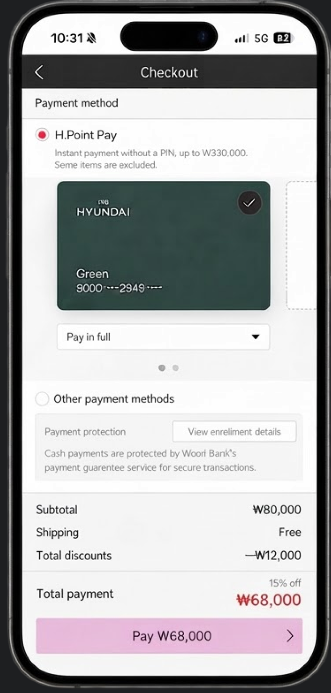
She taps Buy and then spends 42 seconds scrolling through a form to confirm things she already knows.
72% of shoppers who reached that form never finished paying.
The purchase conversion rate was 28%, and customers were dropping off during checkout.
Our goal was to reduce checkout friction and help more customers complete their purchases.
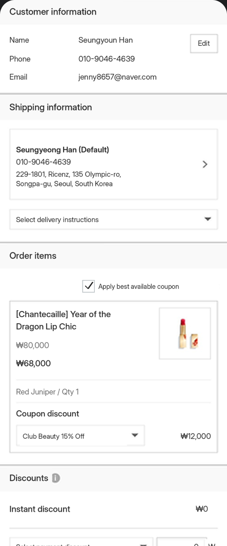
Before
The existing purchase journey took an average of
42 seconds, from selecting a product to
completing payment. Analysing this journey revealed that customers
were dropping off at the payment stage.
APPROACH
STEP 01
The existing checkout was tightly coupled with membership and payment logic. A full redesign would have increased development time, cost and the risk of disrupting existing payment flows making it impractical within the launch timeline.
Informed a bottom-sheet approach that would let customers check out without leaving the product page. I prioritised speed and a simpler flow over a complete restructuring of the checkout experience.
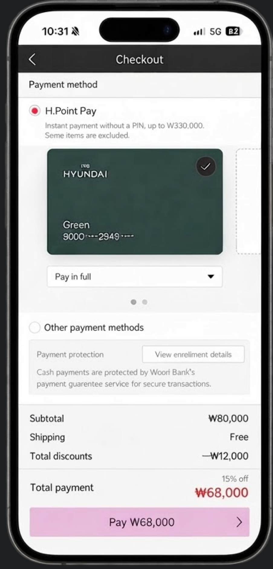
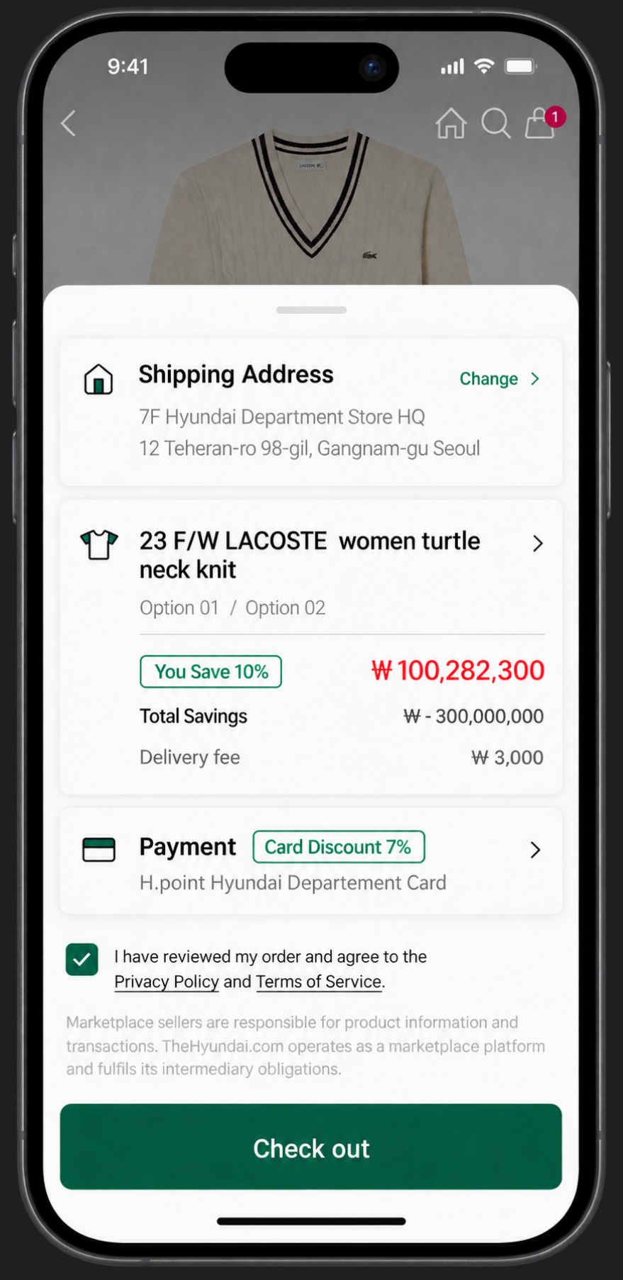
Retain the existing form structure and keep the
Pay button fixed at the bottom, so customers can
access the payment action without scrolling to the end.
Trade off
Lower implementation effort and risk, but usability
remains largely unchanged.

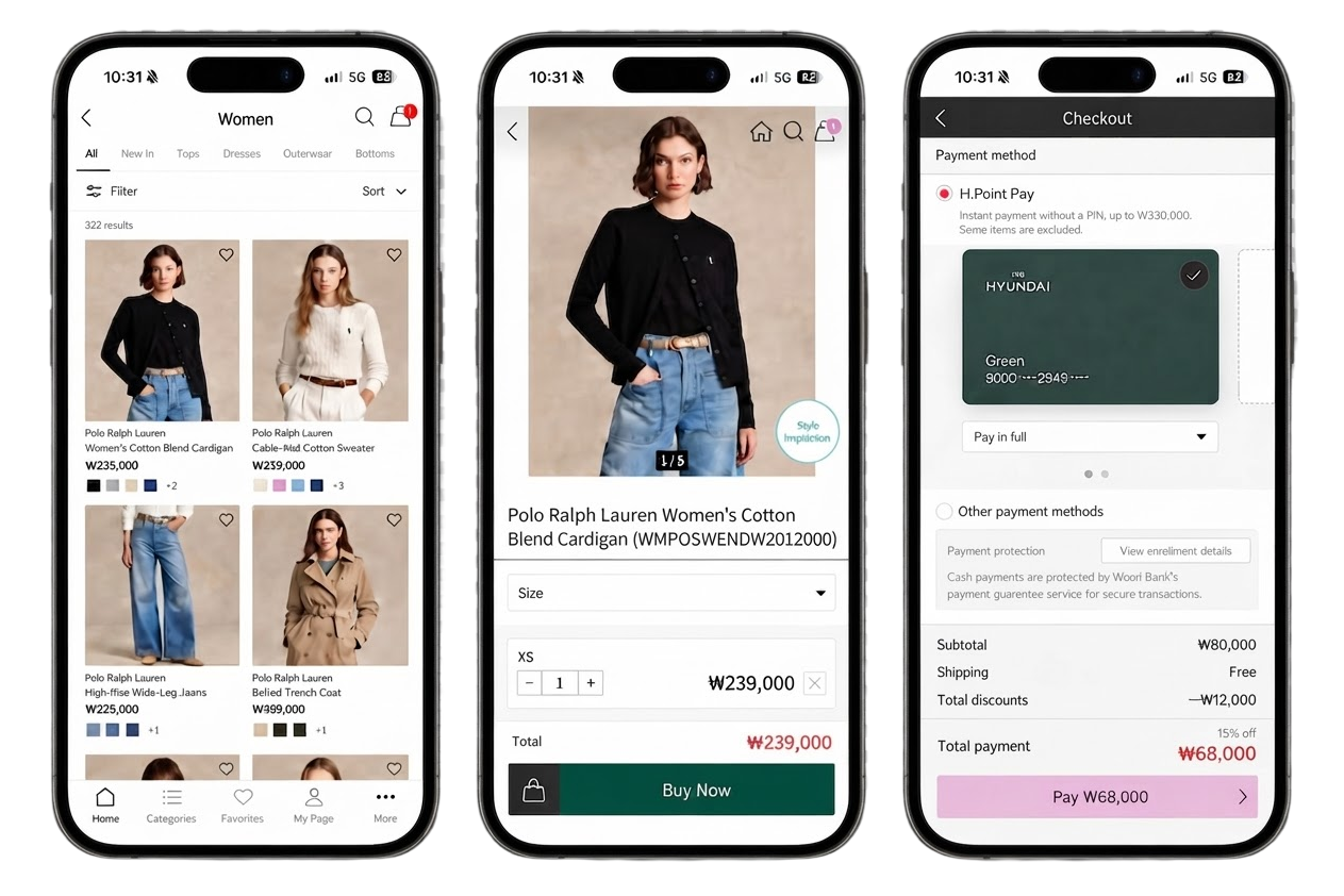
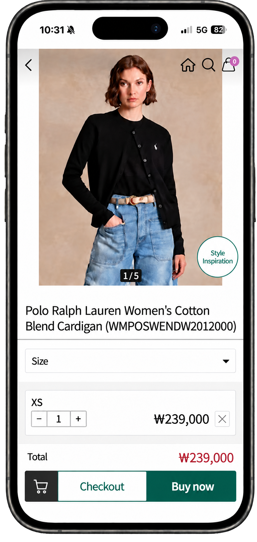
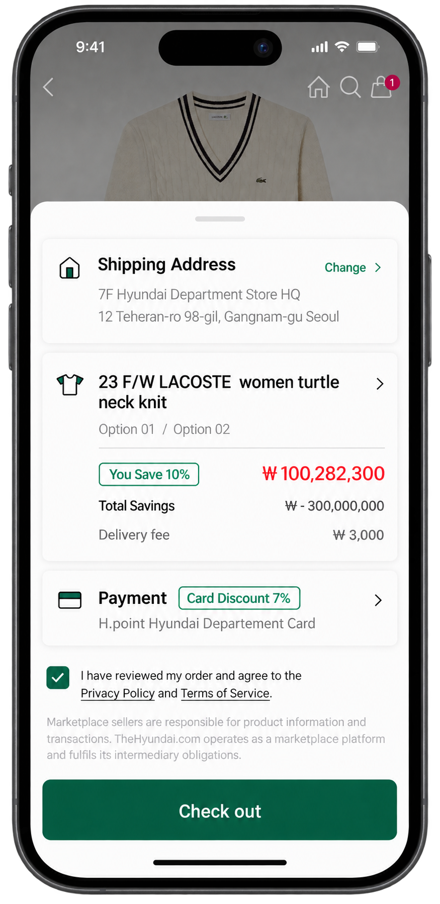
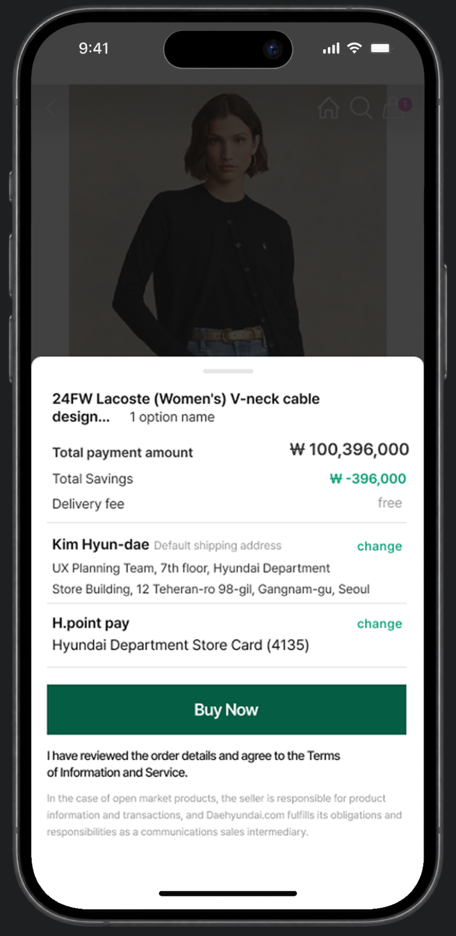
Added a Buy Now button to the PDP.
Tapping it opens a checkout bottom sheet with only
the essential information, allowing customers to complete their purchase.
Trade off
Prioritised a faster, simpler checkout experience at the cost of additional development time.
STEP 02
After we introduced the simplified payment UI, customers were still hesitating. So I interviewed 10 of them.
Interviews indicated that customers primarily focused on the final payment amount, applied discounts, and delivery information when confirming payment.
We interviewed 10 users in their 20s–40s, with a range of usage frequencies for the simplified payment service.
3 people prioritise the final payment amount, followed by product info and discount details.
Total amount → Product info → Discount details → Shipping confirmation
Customers usually confirm shipping details quickly unless it’s a special case, such as gift delivery.
Total amount → Discount details → Delivery date → Refund method
Through customer validation interviews,
we
restructured the information hierarchy around
customer priorities and
eliminated UI friction points in the payment flow.
STEP 03
Post-launch analysis over 32 days showed that 17% of completed orders involved a payment cancellation followed by a return to checkout and a new purchase. Analysis period: March 27 – April 28 (32 days).
Post-purchase behaviour analysis using GA4
Out of
250 completed
orders
To check
discount details
Users receive 5 base discount benefits, and as high-involvement products include more product discounts, VIP discount details become increasingly important.
To use
H.Point rewards
H.Point can be used online, in-store and
with affiliated partners.
Points can be used like
cash (₩), from 1 up to
9,999,999 points.
Core users, particularly middle-aged women, showed a strong tendency to carefully recheck discounts and rewards at the final step.
Interviews confirmed that missing or unclear benefit information increased hesitation right before payment, even when purchase intent was high.
A month after launch, GA4 showed that 43 of 250 completed orders were cancelled and placed again.
We’d optimised for speed and removed the two things
our
core buyers most wanted to verify:
Their discounts and their
points.
Speed was never the
whole problem. Trust was.
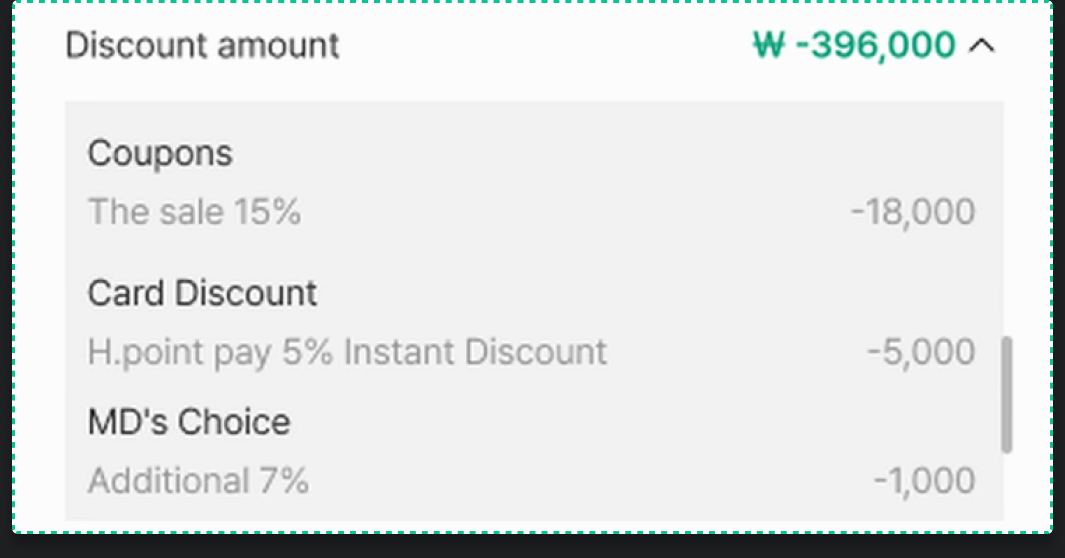
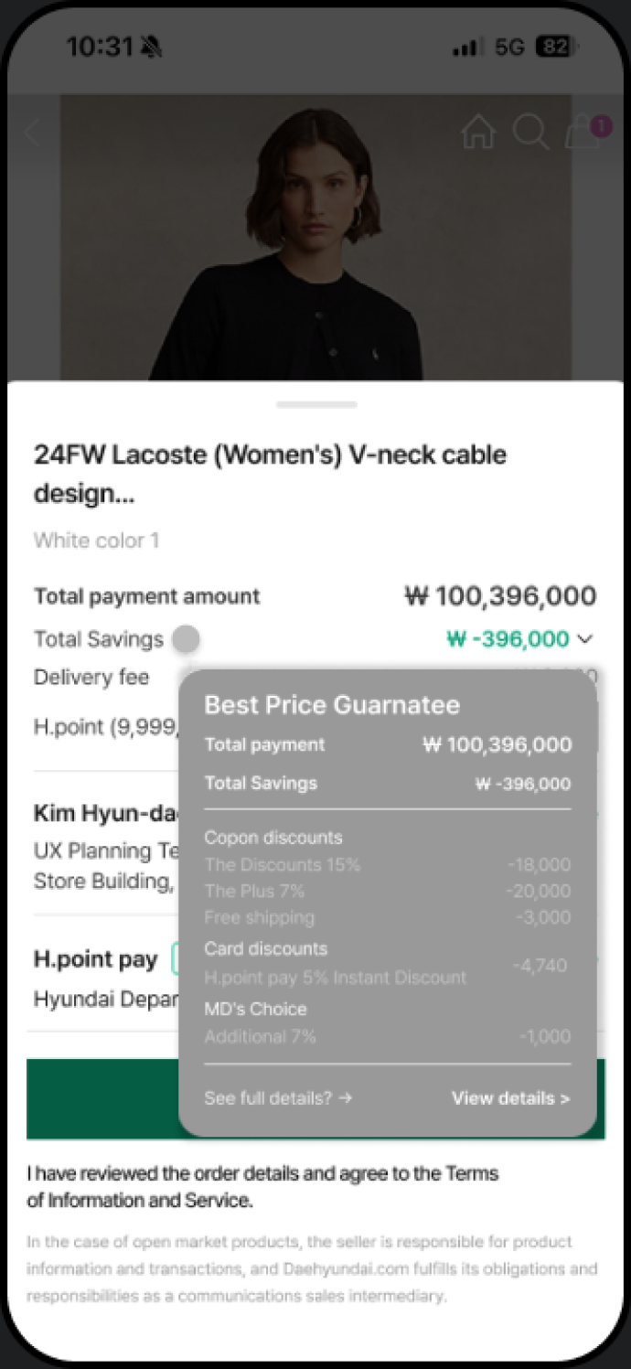
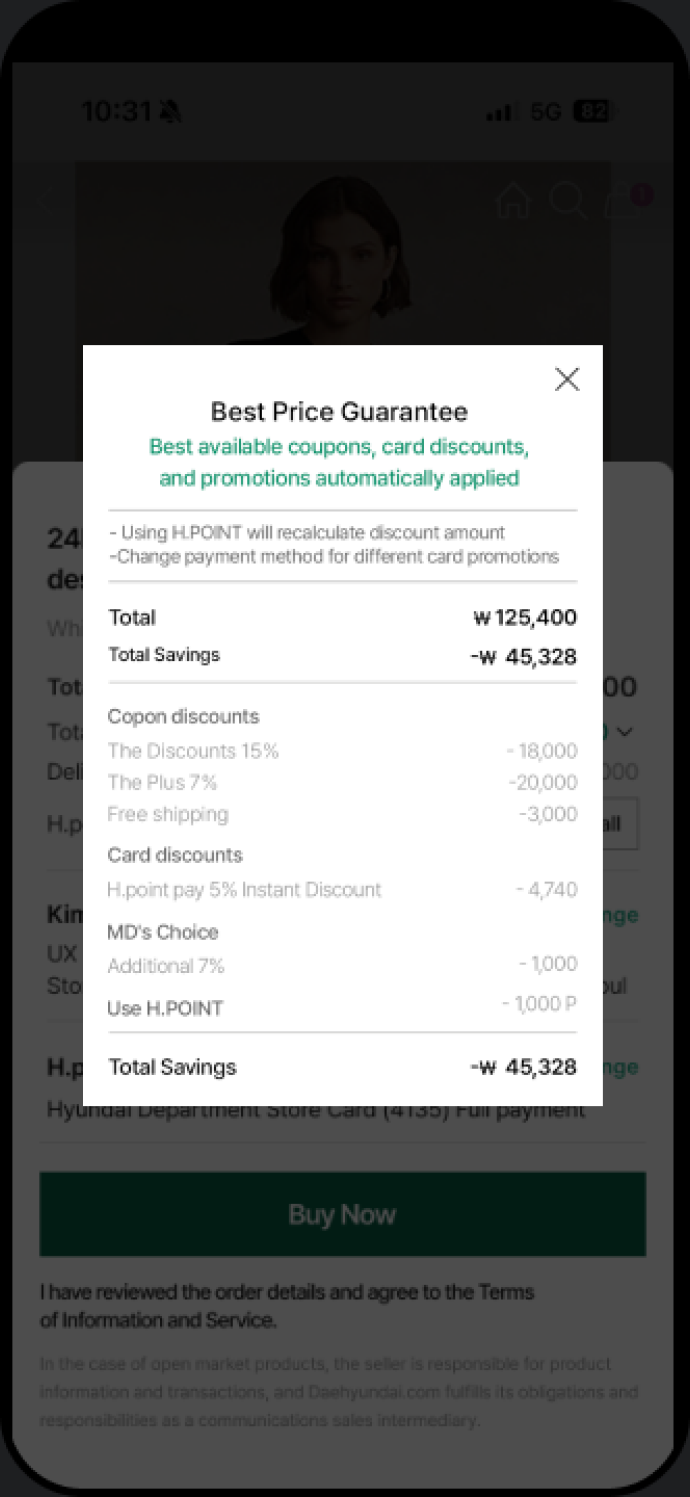
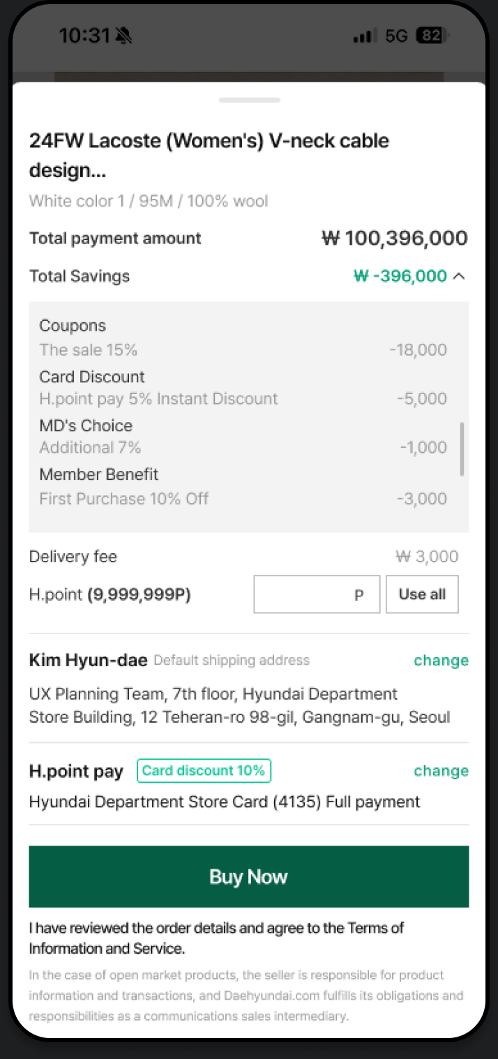
After testing three approaches, we chose the dropdown to keep discount details visible within the checkout flow, trading a more compact layout for greater transparency.
Discount details appear in a compact tooltip within the checkout screen.
A full-screen popup provides a complete view of all discount details.
Discount details expand inline within the checkout screen.
FINAL DESIGN
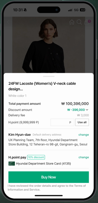
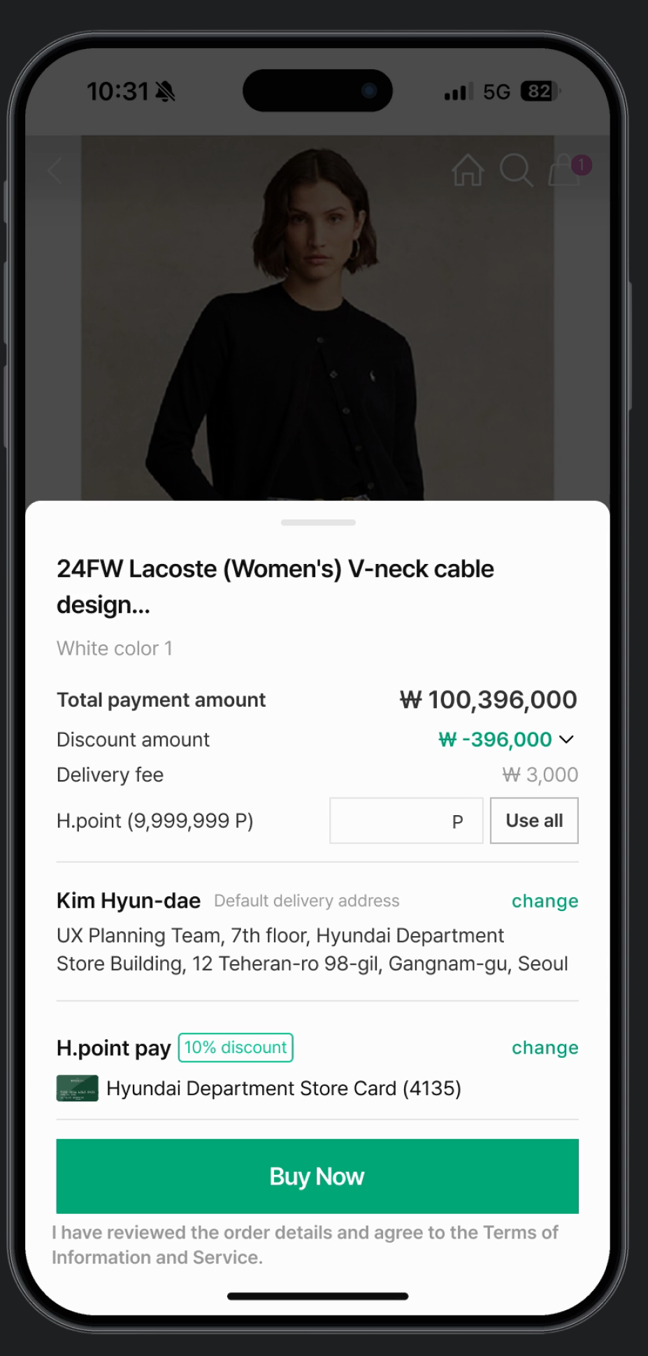
After multiple iterations, I introduced a dropdown for viewing all discounts on one screen
and added H.Point redemption, allowing users to apply their preferred amount directly at checkout.
Maximum discount benefits visible on
a single screen without scrolling.
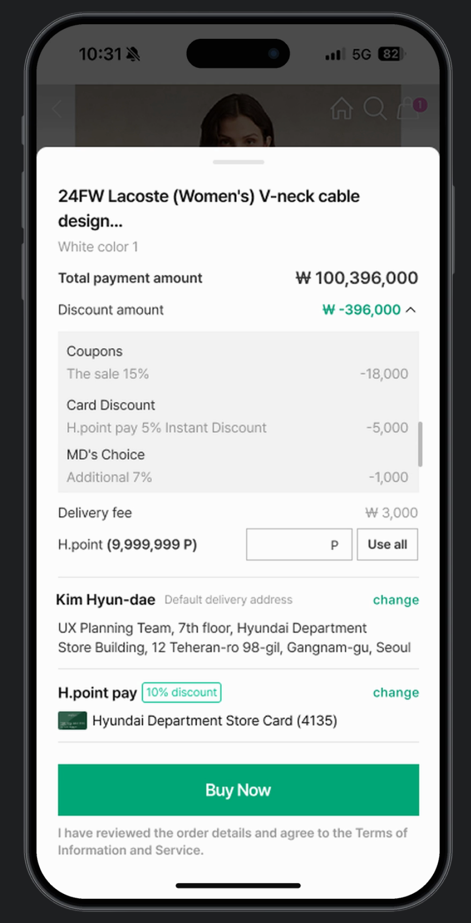
Input field and use full amount button
for instant point application
RESULT
+74.7%
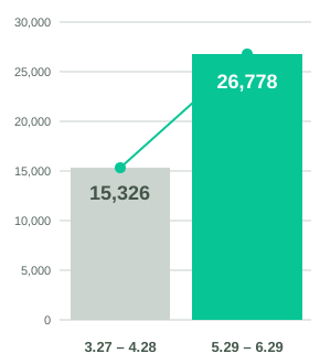
15,326 → 26,778
+11,452purchases
42s → 6s
−36 seccompletion time
Converting leftover gift card balances into H.Point increased perceived value by allowing customers to use points both online and in-store.
Users valued being able to apply H.Point directly without moving to a separate order screen.
Seeing discount benefits upfront reduced hesitation and helped users complete purchases more confidently.
REFLECTIONS
Discount details and H.Point usage during initial order formanalysis highlighted the need for more thorough researchvalidation and sufficient testing before launch.
In focusing on scroll and button fixation in the existing order form,I overlooked a more detailed analysis of the Payment Zone Information Check (Step 01)
There was a lack of analysis on why customersat different membership levels.
The oversight occurred because the interview questions were primarily focused onaddressing the initial design issues, without delving into the existing order form’s functionality.